Thursday 26 February 2015

4th Year Film/TV Collaboration (Meaningless)


Its collaboration time again and this time I have been assigned the task of helping 4th year film/tv students with any animation related things they need doing in their films. We listened to each of their pitches and we got to decide on what ones we like the best and so I am helping 4th year Lucia with her funny but also tragic short film 'Meaningless'.

To start off we first talked about what she wanted me to do for her film which included various things such as: the essential title sequence, posters for the set, animating a stopwatch for one scene,  and doing another smaller title in another scene and some other little bits and bobs. The two animations within the scenes I will need to wait for until they have filmed the footage for me to work on, my plan being to animate over it so that it flows well within the shots. This leaves me to focus on the posters and the title sequence first, something which I don't think will be too hard to do as this is definitely seems to be right up my ally and should be pretty fun.

I started first with the title sequence, in the beginning I wasn't really sure what Lucia really wanted but she gave me some 80s retro movie posters to look at, as she wanted an 80s themed title, this being the sort of theme and time the film itself is set in. I started of by doing some research and looking at fonts that matched some of the movie posters she had showed me (Boogie nights, forbidden planet Godzilla e.c.t.) and began to look on Pintrest (https://uk.pinterest.com/) for some. I ended up finding quite a few, really helping to give me an idea of what 80s style fonts are like, these are some of the fonts I was looking at:


Not wanting to have to create my own font I went a head and sourced some fonts to use in the title sequence, selecting a range for Lucia to look at and choose which one she wants to use in the final thing.


Fonts sourced from http://www.dafont.com/
While I am still waiting on the her choice, I decided to go and do a couple of experiments with some of the ones that I sourced, using the same colour schemes to try and recreate there looks and aesthetics.


Overall I was pretty happy with them and felt that I had kind of recreated that 80s font style look and wanted to try and take the first idea that I had created and make the background spin to add that animated element to it.


Background from Tyler Carrigan on Vimeo.

I had another meeting with Lucia and showed her the fonts and ideas that I hade been playing around with, she liked them but they were not what she wanted as she didn't want the background to be animated and  just wanted it to be plain and black. I was not really bothered by this as I was just experimenting and doing some tests and I had fun doing them so I guess its back to the drawing board! However I am still waiting on a decision on a font... but we agreed that I could just leave this to a later date and should focus on the posters and bus stop sign for the sets as she needs them before shooting.

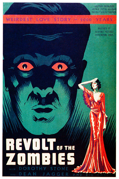
And so not being sure of what to do for the posters I decided to go ahead and again do some research. I came across a lot of robot and zombie film posters which I quite liked the look of so I wanted to create my own. Starting with the robot poster, I again went to Pintrest and Google to source some images for  inspiration for my robot designs, hear are some of my inspirations:

Forbidden Planet
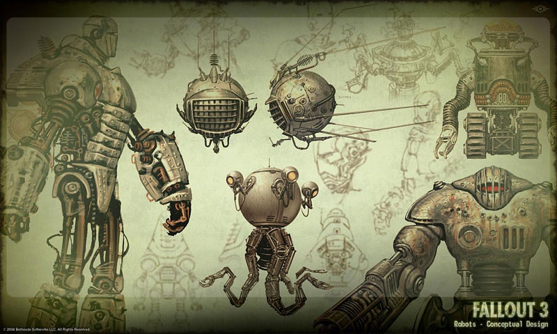
Fallout 3 Video Game Robots
Lost in Space Robot (1998)


I took these images and began to sketch some of my own robots, I knew I wanted the poster to be kind of an homage to the classic 50s sci-fi, killer robot movie posters, so I wanted to make the robot look overall menacing.


I took one of the robots from the first page and began to draw it out in Adobe Photoshop making the poster very comical and cheesy just like the 80s really... Also wanting to make the robot menacing meant that I had to make it visually central on the poster, making it huge also helped with this as it is towering above the earth, visually representing and reinforcing the title of the poster.

Yea its really called that
For the zombie poster it was very much the same process, I again done some research looking at zombie posters, taking a lot of inspiration from the 50's and then created my own on Photoshop. My inspiration:


And then I created my poster:


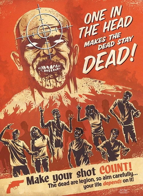
For this poster I quite enjoyed the drawing of the zombie characters and designing the overall thing. I played around with the colours a lot, deciding weather or not to add it, but eventually I ended up opting for the basic red tones as done in the examples I looked at. I feel like this was more effective in the end as it makes the zombies more intimidating and threatening in my opinion and equally makes the whole poster stand out more.
I overall had a fun time creating these posters and really enjoyed the process of it. However I did feel that this process was quite odd as the director could have used any posters rather than myself having to create new ones.

 I then went on to create the bus stop sign for another set piece. This didn't actually take too long and was something that was quite easy to do.


Lucia the director also wanted me to create a 3rd poster, this one unlike the others would be hit at the plot. She gave me this image to rotoscope and the image below was the style she wanted it to look like:


And then I came up with this...

Again I feel like I have captured the style of the example well, simply tracing over the image on Photoshop and adding some shadows to the drawing, keeping the overall thing very simple and plain. I had this in mind equally with the placement of the text and the border round the image, keeping it very basic and making it look sharp, helping it reflect the title of the film. 

Once the posters were done it was time to move back onto the films title sequence. Lucia had chosen a font that she liked and gave me an example of what she wanted its colours to look like:  


I took this and began to create the font, something which didn't take long to do. Adding white highlights to the letters make the words more prominent and contrast more against the black background behind, they also help to give it that extra 80s feel. In the end I quite liked the look of the font and I was happy with it. I also included a fade in at the beginning just to introduce and subtly enforce the title a bit more.


 Once Lucia had finished shooting all of the scenes of her film she realised that she wanted to change the titles colour using the colours that were in the film, giving it more coherence through out. She gave me another colour example, wanting a more burnt red to be used to match with the boat in the square scene:


Using these colours, I again went through the same process and came up with two options for her to choose from. The first one appears quite similar to ones I made previously with its colours, but the second one is much darker and has the more rich, burnt red colour to it and this was the one Lucia ended up choosing.


And so I went ahead and made the title fade in and fade out on premier, again this didn't take to long to do and this meant that Lucia could edit it any way she wanted:


I also began to work on the second title, this one was for the dream sequence in the middle of the film. This title had to have a Chinese font as the dream sequence had a Chinese theme also. When colouring the font, to keep it coherent I created it in the same method as before, with the title using a basic colour and adding white highlights to bring it out more. Here is what I came up with:


Again I did a couple of concepts giving her the choice of the style she wanted the font in. She ended up choosing the 3rd one (This one wouldn't have the black background, was just to highlight the highlights!). This was just a static title that would be placed at the top of the scene so this was all I had to do for that. 

Overall I have quite enjoyed this project designing posters, helping out with the films title sequence and designing some of some props. However I felt like my original position as an animator in this collaboration has not been met, as there has not been much animation involved. Originally there was a scene were I would have had to animate a stopwatch/timer ticking down but that scene was taken out of the film entirely, so I feel like I have just acted as a graphic designer for this project and not an animator. I'm not saying that this is a bad thing by any stretch of the imagination, as it has allowed me to focus on design a bit more and see how and what the process of working for a director is actually like and it has certainly been eye opening! But I have also and most importantly had fun doing so and I think that's the main thing.  

Saturday 21 February 2015

See Hear Project Part 1

For this project we given the task of creating a piece of music form everyday sounds and then animating over it, these sounds could be anything from someone talking to footsteps on the pavement. However we were divided into 2 groups indoors and outdoors and I was placed in the outdoors group. This meant that we had a whole host of outdoor sounds we could record. On the first day we were introduced to the sound equipment which consisted of two microphones, one for directional sound and one that we used for very close up sounds and the recorder which was very simple to use. Wanting to get used to using this equipment we set out to record some sounds to test it out, ending up down at the Meadows where we recorded some basics sounds and some sounds we thought were quite interesting like a stick being run along a fence. As we done this we were beginning to think of some themes that we might want to have, one idea was to record peoples conversations and tie bits of them together but as we recorded other sounds we drifted away from the idea and wanted to focus more on sounds rather than people talking. 
The next day we went down to Waverly station where we knew we could get some interesting sounds. We recorded the trains, tannoy and escalators which left us with some interesting results, some of the sounds ended up being really cool and we were happy with what we collected. We also recorded various sounds from along the Royal Mile like cash machines and traffic which we also though we could use our soundtrack.

Working on creating the soundtrack in Audition
 So once we had our bank of sounds we sat down and looked at where we could use them in our soundtrack. The soundtrack itself had allow for the 4 of us in our group to each have a segment so this left us with 30 second part each, in turn giving us 30 seconds worth of animating to do. Our group took the sounds we had recoded and began to put them together in the software Adobe Audition. We created a beat with them giving a rhythm to the piece as a whole with transition sounds in-between to allow each section to link together when it eventually came to animating with each person doing something different within them.

Once we had the soundtrack complete it was time for me to take my own section and begin to think of ways to animate the sounds within it. As a group we wanted to make it quite abstract and loose and so I had to think of a way I would do that. I came up with the idea of just experimenting with lights and water, using a tank and head torch in my garage with the lights off.  


In this first test I simply simply just dropped nails into the water which produced small bursts of bubbles. I quite liked this effect and I ended up using this in the final film as a background.


For this test I experimented more with my head torch light. The orange glow actually came from shining the torch through a full Irn Bru bottle giving it this unusual effect. I also threw more nails in to see how the bubbles would look under this lighting. 


In this test I used a plastic tube that I filled with water and poured the water back in to see what effect the rushing water would give. I also played around with the tube itself as it appeared quite ghostly in the light, which was an effect I quite liked. 

I ended up creating quite abstract and strange effects when playing around with the water and lights, but I wanted to try also using shapes to covey some of the sounds. Many of the sounds in my section overlap so I thought I could composite shapes over the top of the water and lights footage. However choosing shapes that represent sounds is more difficult than you think as I wasn't sure how complex I wanted that animating to be and as we only had 2 weeks to complete or film in. I stuck to more simple shapes, circles, squares e.c.t.

Sketches of my different Ideas 
Testing possible shape colour


When animating I again used Adobe Photoshop, turning off and on the layers and compositing the images in Adobe Premier to put them together into the sequence. What I surprisingly found most difficult at this stage was the timing of the movements of the shapes in relation to the sounds. It took quite a while to sync the two together due to the fact I didn't do the animation over the soundtrack, but they eventually came together.


Once I had done this I took the animation back into Premier where I keyed the background of the shapes out and composited it onto the water and lights background footage. The background I had edited to be black and white prior and gave the effect of it looking like static with the bubbles looking like white shapes. This overall tied the two together I feel, the water and bubbles acting as a representation of the background noise that runs through the whole section, also correlating with the other members of my groups animations as we each had an element of our pieces being in black and white. In retrospect if there was anything I would change it would probably be the use of the different colours as I think just keeping the shapes black and white might have made it tie in a bit better. However I feel that the final film has come out quite well and I am very pleased with how it has turned out.

Our finished film:

Thursday 19 February 2015

Christmas Advent Animation (Puddings Last Christmas)


Puddings Last Christmas- Tyler Carrigan from ECA Animation on Vimeo.

For our Christmas project we were given the task of creating a 30 second animation that would be shown on one of the days leading up to Christmas on the ECA advent calendar. With this in mind I began to brainstorm ideas of what I could possibly do. I knew I wanted my animation to have a basic narrative, having something that was quite funny but something that was also easy to do at the same time. I played around with a few ideas initially but finally came to one that surrounded the character of a Christmas pudding.

The basic idea was that I would have the Christmas pudding character visiting the log cabin of another character. As it journeyed to the cabin I wanted to show it essentially gaining all of the traits and decorations the Christmas pudding is famous for, its white sugar coated powder, the placing of holly on top and it being lit on fire. The way I was going to convey this was by it being essentially decorated as it walked to the log cabin. Showing this happening almost coincidentally, making it seem quite humorous.

I came up with the idea of snow giving the pudding its white powder, it falling on top of it in some way. I originally was going to have it falling off a tree but then decided to have it slide off the roof of the cabin as it knocked on the door, so as the other character opened the door we would see just a mound of snow of which the pudding would rise out of, revealing its front. I equally planed to have holly hanging above the door so as the pudding stood up we would see it falling on top of its head completing its look. Finally to end the animation I wanted to show the pudding being lit on fire in some way. I ended up having the idea of making the pudding trip into the fireplace, screaming as it did so, giving it a very slap stick comedic feel. All though I also think it is something which can be seen as quite dark but hopefully at the same time quite funny.


I firstly began to draw some character concepts, mainly of the pudding character as he is the main focus of the animation.  As I began to do so I knew I wanted to give it facial features, creating different faces for it but as I did so It led me to incorporating the dripping side bits of the white powder on top of his head into its eyes which gave the character a more original friendly look, of which I was overall quite happy with.

Next I planned out my film using a story board so that I knew what each scene would look like, story boards being particularly useful when it comes to planning the camera angles of a scene, the way the characters are in a shot and also giving you a overall visual representation of the way your story is going to play out. Now understanding how indeed each scene would look, I went ahead and began to draw the backgrounds first as this would allow me to animate over the top making character placement easier when it came to animating.


I created the whole animation in photoshop, animating each scene by turning off and on layers that I had drawn over the backgrounds. It as a whole consisted of 9 scenes in total, within which I had to animate, colour, shade and highlight each frame, background and character and lets just say I had my work cut out for me. I only had time to animate and edit within a 2 week period, and even for a 30 second animation was not much time.
Animating the Pudding in Photoshop
 My 2 weeks mainly consisted of  me having to do all-nighters, which looking back I realise that it was my own fault due to the fact that I made my animation quite polished, but at the same time I felt the end result was worth it but next time I may just make things a bit less detailed!  I ran into problems with after effects when editing again as I had actually added snow falling in the outside scenes but I couldn't get it to render in the proper 1920x1080 format so to finish the film with in the dead line I ended up just leaving it out. Besides this hiccup, I added a title, credit sequence and music in premier which did not take to much time and overall tied everything together finally.


Overall after the 2 weeks of having not much sleep I finally managed to get it done. I was very happy that it was over but at the same time I was equally pleased with what I had achieved and how the film turned out in the end.


Bye!