Hello, welcome to my little corner of the internet!
I'm a student studying Animation at Edinburgh College of Art and this blog will be the home of all my animation shenanigans.
This statue was actually made for my friends birthday, since he loves the show Rick & Morty.
Initial sketch to figure out what pose I wanted the character to be in.
I built a wire frame for it, covered that in tinfoil to bulk it out and then slowly added Supersculpy. Building it up to get the characters basic shapes and features.
Once sculpting was nearly complete I ended up changing the left arm because I wanted him to be holding a beer instead. This meant re-molding the right arm and attaching a new had. I also attached the beer bottle to the hand, and subsequently built up the hand on the side of it.
Once this was done I set about getting some scrap pieces of wood and gluing them together, creating a thick base for the model to stand on. Once this was done I baked the model and then glued it to its base for painting.
The Final Model:
Scottish Anti-Hero Character Concept for Kickstarter Campain:
This drawing was actually for Wayne Mazadza, my Film and TV Collaboration partner who wanted me to design him a Scottish themed Anti-hero for his films kickstarter about this character.
Original Idea/ Sketches:
He gave me some images of anti-heroes he was looking at and wanted me to do something similar to these:
I took these and began to make the character really rugged and homeless looking, which was something that he originally wanted the character to look like. He was also looking at different weapons he could have, ending up choosing a sledge hammer for him to wield. So this was another thing I need to think about in his design.
After doing some initial rough sketches in my sketchbook I decided to take the character into Photoshop and do some cleaner designs.
However when I showed Wane these designs he said that he liked them but this wasn't really what was looking for. He told me about the changes wanted to make to the character, making him overall more superhero like in appearance, giving him an actual kilt and having him ware some body Armour like a bullet proof vest. Again I went back to the drawing board and did some new sketches of the character.
Once I had a design I was happy with I went ahead and created the final concept in Photoshop.
Final Character Concept:
After editing it a bit to make the proportions a bit more in scale, I was really happy with how it turned out. I showed it to Wayne and he loved it, and said that he could take this and add a background to it and such. So job done!
For the Two Characters, one Setting project we were given the task of using these three elements in a way that could tell a simple narrative.
Ideas Stage:
To begin with I began brainstorming some possible narrative ideas that I could do. My first idea was that I could make an animation that deals with the theme of addiction or illness, having one of the characters act as a captive while the other would act as the actual illness/ addiction. In this way I was thinking about possibly conveying this by having a boy trapped on a single stone pillar while a massive dragon would be circling him, keeping him trapped there. I think this is a really cool idea, however I was thinking very deeply about whether or not I was not sure if I can convey theses topics in such a way just yet. What I mean by this is that these topics are very complicated and complex and if I were to do it I would want to do it right. Not saying I couldn't its just I would want to do it in a manner that was proper.
My other idea/ideas involved the dynamic of a large character and a small character and the ways they would interact with each other. The two ideas were quite similar in that one idea was to have the bigger character help a smaller one over a bridge. And the other was to have a big character help a little character up a steep cliff or hill. I quite liked this dynamic and knew it would be something that I would probably do since it would allow me to create a simple narrative and have simple characters that I could play around with. It could also give me a way to do something possibly sentimental or even something lighthearted. When sketching what I had in mind for how they would look, I became more drawn towards the bridge idea. I kept trying to think of other ideas but there was something that kept pulling me back to it. And so I decided to go with that one.
Research:
Once I had finally picked my idea it was then that I began to do some visual research on Pintrest. The initial idea I had in mind had the setting of a bridge in the middle of the forest, so I wanted to look and woodland themed characters and backgrounds.
Character:
My Two Characters Pintrest page link: https://uk.pinterest.com/tyler1599/two-characters/
Background/ Setting
My Backgrounds Pintrest Page Link: https://uk.pinterest.com/tyler1599/backgrounds/
Character Development:
While I was doing this I began to sketch some of my own ideas, drawing some simple shapes just to start off with. I knew I wanted both my characters to look similar but not too similar, still letting the audience know that they came from the same setting. I came up with the rough designs of my characters quite quickly, as you can see below. However these would function as the foundations for me to build upon later as I developed the characters further.
Testing out what the characters would look like together in their setting.
Once I had these foundations I began to build upon them, fleshing the characters out more, smoothing them out and overall just simplifying their designs further. I firstly began with the smaller character, trying different body types, however I quite liked the hunchback design as it suited the characters actions of carrying things over the bridge, he looks like he was built for that. I even began to test out things that he could carry over the bridge, giving him lots of random junk. An idea which would later be carried on further into the final film narrative. I also gave him some tribal-ish markings which seemed to oddly suit the character and I made sure to carry this on in the design of the larger character making its ones slightly different to tie them to each other in a subtly way.
For the big character I knew I wanted to give him quite an intimidating and mysterious silhouette, however at the same time I wanted him to actually be friendly and curious. Conveying his character to start off in the misty background behind the trees, again as this mysterious and intimidatingly large creature in the background. While when in the foreground he would be this friendly bumbling giant. When designing him I went through many body types, originally starting off with a kind of S shape, however I didn't think this conveyed how massive I wanted the character to be and so I ended up going with a kind of bearish body type. Giving the character the heftiness and mass I was looking for. I also re-designed the head making it much bigger and slightly squarer to match up better with the body. Trying out different antler and horn designs until I found one that I liked. .
Character Workshop with Rachel:
In the middle of the project we had had a character making workshop in which we created characters via making Plasticine models first and then sketching them. Before this however we were told to got to the museum and sketch some of the animals there for some inspiration. Because I already had a good grasp on my characters design, I used the time to do some sketching, however the mask section was useful as it allowed me to look at some actual tribal markings and look at the ways they were incorporated throughout the masks.
During the workshop I sketched some really cool characters. I was really happy with they ones I came up with and the workshop was really helpful and intuitive and I had never thought to design characters in that way before.
Story Boarding/ Narrative Construction:
Once I had my characters to a point I was happy with I began to storyboard my film in thumbnails first so I could figure out how the narrative would pan out. I developed upon my original idea of the big character helping the small character over the bridge by having the big characters curiosity of the bridge causes him to accidentally brake it. The small character needing to get over the bridge for an unknown reason,(throughout the film he is carrying random things from one side to the other) to which he finally meets the big character. Being scared initially due to his intimidating size, however he is then is surprised by his kind act of helping him across.
Concept Ideas:
Once my basic narrative was figured out I began to draw up some concepts for our two character catch up meeting with our tutors.
With these I really wanted to try and get a sense of what the final film would look like. This also allowed me to figure out the scale of the characters in relation to one another and how I wanted them to appear within the frame.Feed back from the meeting was good and they seemed to like my idea and where it was going. However one of the suggested changes I should make to my characters was their circular eyes. I quite liked them how they were, however I went ahead and drew lots of different types seeing how they would look on the characters. Overall none of them really stuck out for me like the original ones did and I just decided to stick with those. I totally understood why the suggestion to change them was made however I felt like I could make them work. I was thinking about changing the colours of them each time the react to something like a traffic light. Possibly being something that can show how they are feeling however I'm not sure at this point.
Character Colour Design:
Once this was done and I had my character finalized I began test out what colours they would be.
Again because the two are in the setting of a forest, I figured that especially for the large character (since I imagine he would be living there) that he would have very earth woodland colours.
It was different for the smaller character however because I wasn't entirely sure what colour he would be at all. And so I just ended up trying him out in a range of colours. I actually ended up asking my fellow animators in the studio what colour I should choose for both of them and everyone went for the brown for the large character, and the dark purple and dark green ones for the small. I personally quite liked these colours myself and thought that they suited the characters.
Characters Within the Setting/ Character Colour Test:
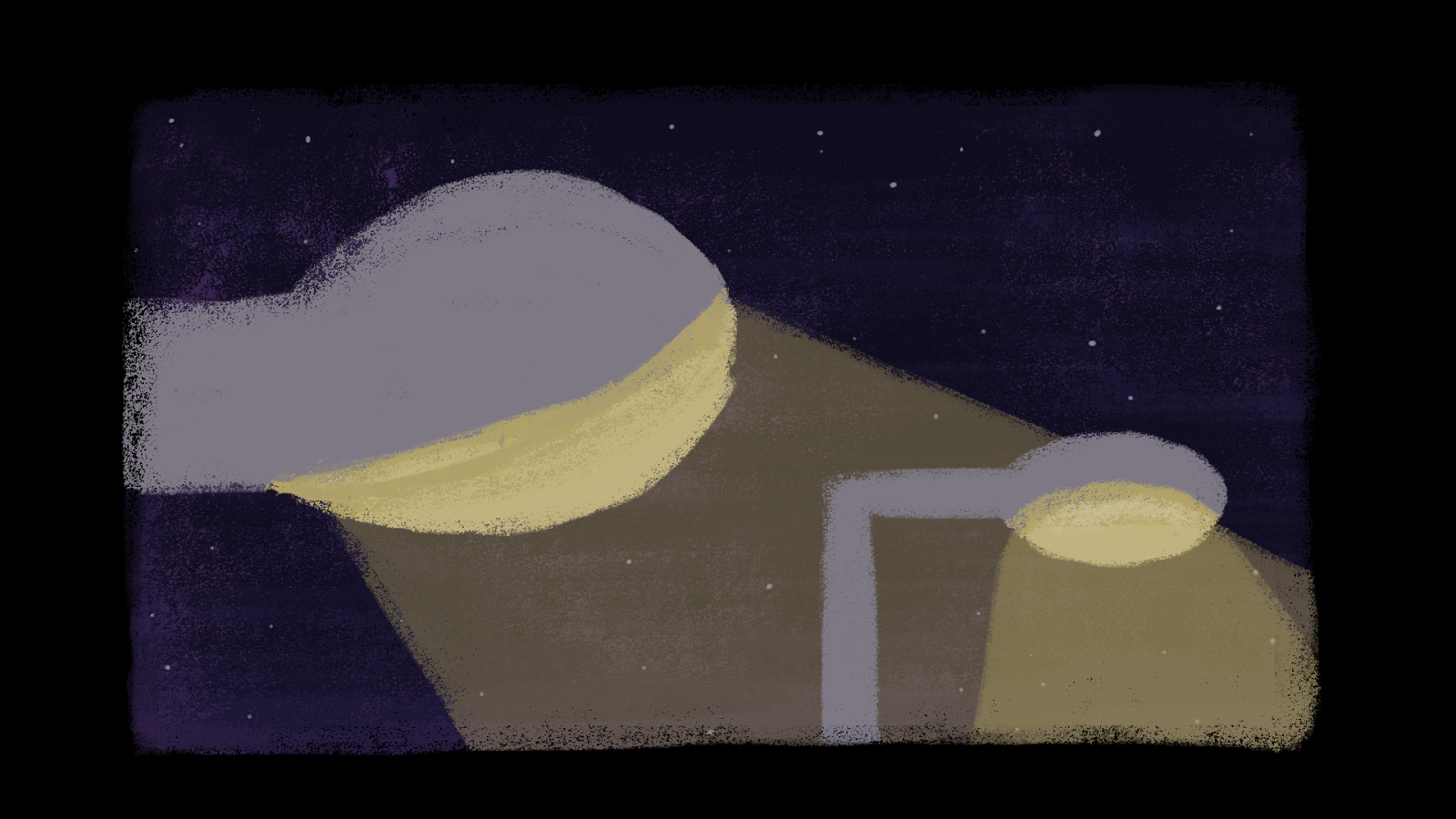
Next I set about colouring the background and the characters within it. I again went for very traditional earthy colours keeping them very dark. I also added a blue hue over everything just to make it look slightly colder and tone down the colours of the background a bit. This was down to the fact that I wanted it to look as though it was really misty. I have plans to animate the mist slowly moving in the background throughout the animation, giving the scene a very calm atmosphere (hopefully).
In this scene I wanted to test out how the big character looked in the background. His shadowy appearance does make for an intimidating figure in the background, something I was happy about. It was at this point suggested to me that I should make his eyes glow as well. Something which actually turned out to be a really cool suggestion and I was really happy with how it looked.
Again I tried two versions of the small character, one with the dark green and one with the dark purple. However I found that I liked the purple version better so I ended up going with that.
Final test version.
Animatic:
With the actual proper storyboard, I went ahead and scanned it in- turning it into an animatic for me to use when it finally came time to animate. (Animatic can be seen below)
And so once the jewelry collaboration formative review was over and done with and we now had 2 weeks Easter holidays I decided to use this time to try and do all of the animation (Something which is taking way longer than first anticipated- clearly). All of the animation was being done in Photoshop using layers and the animation timeline, which I had never used before. At this stage I was just focusing on getting the animation done and so no colouring or shading has been applied yet.
Quick Narrative Change:
During the last weekend of the holidays myself and Amy (a fellow animator) were talking about my animations narrative and how I felt that the middle section needed to be changed and there need to be something more than just the character helping the other character over the bridge and off he goes. We brainstormed it for a bit and came up with the idea that as the little character is crossing the bridge he drops something (later deciding the thing that he drops is a scarf) and leaves it behind as he crosses back over a second time. This allows for the big character-rather than fading to behind the trees again as time passes- just to stay there and come back up from hiding and be looking at the scarf. As he does so, I figured that the small character could come back into shot a notice the big character and react in the same way as before. However when he gets lifted over the bridge by the big character the first time he could pick up the scarf he has dropped. Again the big character takes him back over the other side again. Once this is done I want the little character to give the scarf to the big character as a thank you and then leave the scene and the film ends. Credits role. And then I wanted to show the bridge again, now fixed due to the scarf being used to tie it together.
I felt like this was a way better way to tell the narrative and quickly drew up another thumbnail storyboard for me to follow when animating.
Animating Still Ongoing:
Currently at this point I am still animating and I still have the last couple of scenes to do. This includes the bits and pieces that are missing in the animation and still need patch up. I also still have the colour, sound and editing to do. However I am hoping to get the animation done for the film house deadline.
Finally I have manged to get the film finished for the film house! Yay!!! However I still think I want to return to it and go back and add more colour and shadows to the characters and maybe clean up the timing a bit. But I'm glad that its got to a point that I can say it is almost finished and again I'm quite happy with the way this has turned out. Here is the latest version below:
My Thoughts on the project:
I have really enjoyed this project, however I am a bit bummed out that I haven't managed to finish it before the deadline. However I feel like if we had more time to do this project I think I would have got it finished. Even though it was spread over the entire semester I felt as though all of the other projects that we had in-between this one, including context required us to be really full on and I felt that this project suffered because of that. However I think this has been one of my favorite projects so far. Having been one that has really aloud us to develop our very own narratives, character and settings a whole lot more than any other project has.
And so it begins.... On the first day of 10x10x16, I set out with the intention of creating the Tiki Tiki film (actually created on day 06) spending half the day molding Tiki heads out of plasticine- with the intention of animating them under one of the rostrum cameras. However as the day progressed I began to realize that I wouldn't have time to make this film and push it back to another day. This was because I had the added problem of not being able to use main rosterum cameras in the dark room, due to there only being 3 of them and 30-ods of us. We had the take 5's to use instead, but the big problem there was that glare of the layered glass caused by the lights overhead made it impossible to animate on without seeing the camera above. So I chose not to bother. I think this was ultimately me trying to go for something too ambitious on the first day but I was glad to get the models made and out the way.
Having only half a day left and having practically nothing animated I began to feel the pressure a little bit. I had a load of pre-planned film ideas lined up for 10x10, however I knew I wouldn't be able to make these within the time frame I had. And so after a little think I ended up just animating a tortoise eating a bit of lettuce. It is a pretty simple idea, but it gave me something quick and simple to animate. I animated this in adobe flash and then cleaning it up in adobe a Photoshop.
Overall after a slightly stressful start to the project, I feel that this little film I had produced in very little time and the prior events of the day gave me a taster of what was to come and helped me- in a way- ease in to 10x10 and I was looking forward to the days to come.
"Lumber" was originally a film inspired by both the "Powerpuff Girls" cartoon action sequences and the opening title sequence shot of batman standing on top of a building from "Batman the animated series" (as seen below). An odd combination I know, however I had an idea in mind that involved a superhero like lumberjack who would fight crime and wrong evil doers. It being 10x10 I thought it could be something quick, fun and interesting to do. I liked the fact that within powerpuff girls they would use various still imaged action sequences (like the one below) without having to animate anything. I thought this would be a really cool thing to try and do myself, and figured it would be pretty easy to do being still images.
When it came time to come up with a narrative for this superhero lumber jack, I began to think about the well known superhero story line of a cat being stuck up a tree. I thought about how maybe I could make it comical by having the lumber jack chop down the tree to get the cat down, but then this subsequently causes the tree to fall onto the old woman. Once I came up with this small narrative I began to really quickly scribble down a rough story board for me to follow when animating.
Quick Story Boards
Next I began to actually animate it! I decided that I would hand draw all of the animation, something which I would later regret as this literally took me all day to do. This included animating, clean up of the frames and lines and then inking. By this point it was pretty late on in the day and I was worried I wasn't going to get it finished. I then quickly edited the film together choosing to key out the white of the paper and only leaving the lines of the drawings visible. Adding to the lumber jack theme, I thought I would experiment and add in a wood texted background. Something which I think looks ok, but honestly I'm not very happy with the look of the film, nor some of the timings within it. I think the pacing is all over the place and the black lines against the textured background sometimes get lost. These things are things that can ultimately be fixed, but for what it is in its current state I think its an idea I can take and improve upon at a later time.
"Lamp Post Love" is a film that I am quite proud of and is one of my favorites from 10x10. It was an idea that my dad gave me when we were discussing ideas for 10x10. The basic premise of the film is all based around lamp post puns, in this case "you really turn me on". And the idea that two lamp posts talk to each other via shining light onto the road and essentially text each other- one trying to chat up the other.
Quick Story Boards
I really just wanted a nice, stylistically pleasing, funny little story that was easy to animate. And after doing a really short storyboard I set about animating in Photoshop. Using a really nice pastel brush, I had bought in a pack from Kyle Brushes online, giving me a really nice and simple aesthetic to work with. I choose to have the animation scaled down into the center of the screen again for stylistic reasons as I think it gives it a kind of windowed aspect. Like it has a border around it, keeping it clean and simple.
This film was surprisingly the easiest and quickest film I had made in the entirety of 10x10. It is one of the more polished looking ones too and I think this is why it is one of my favorites. I am just really happy with this film overall and especially with with the way it looks as it is very different to my usual style and I was really happy with that.
"Astronaut Soup" is a film about an astronaut floating in what we think is either space or some sort of ocean, however it tunes out that hes actually in a bowl of soup. What I wanted to do with this film was try a trick the audience into believing that the astronaut was in space, and coming to the realization that hes actually in the bowl of soup. When coming up with the idea and drawing up a quick story board. I originally wanted the large astronaut to react to the small one he finds in his soup in a way that would resemble someone finding a fly in theirs.
Quick Story Boards
However I found that with this film I was again being quite ambitious and began to run out of time, having to cut the ending short because of the time it was taking to animate and colour all of the backgrounds. Again for the backgrounds I was using the pastel brush in Photoshop, drawing and colouring the same backgrounds 3 times and looping them to create the effect of light streaming through the soup as the astronaut floats to the surface (one of them can be seen below).
Equally some of the animating was done in Photoshop, particularly the end sequence with the astronaut reaching the surface and being spooned out. I also animated the astronauts limbs in the opening shot making it seem as though he was floating. Taking this into premier and keying him from left to right to make it seem as though he was floating up. I also did this with the "rocks" that were floating around him, subtly making them float up and down.
Overall I think if I had more time I could have made this one a little better, but I think personally it does what I set out to do with it and in this one I especially liked creating the animated backgrounds.
"Awww Snap!" Is just a little silly film I wanted to make in which a water buffalo is drinking at a lake and that suddenly an crocodile appears from the water with snazzy sunglasses on and says "awww snap!", simple really. On this day we were to create a film that was suitable for kids and I figured that this idea was one that was.
Quick Story Boards
I animated this entirely in Photoshop, keeping it very simple and clean, only using smooth black lines and I white background, I had a lot of fun animating this and again this did not take long to animate and edit together. I quite enjoyed this one.
"Tiki Tiki" is a film in which 2 Tiki heads are sleeping and one gets woken up by a coconut hitting him in the head, thinking that this was the doing of the other Tiki head tries to wake him up by shouting at him. With the platicine models of the Tiki heads already been made prior, I was able just to go right into animating which was really nice. However again I tried to animate on one of the take 5s, this time with the lights off, but again I was still seeing the camera above on the glass. I also tried just taking photos of them with the take 5's but for some reason the quality was not very good. Meaning that I would have had to cut each part out individually, something that would take to much time to do.
Concept for the Tiki Film
What I ended up deciding to do instead was actually scanning the individual parts of the models on a green background into the computer so that I could key them out and just animate them in Adobe After Effects. This surprisingly worked out well and It would be easy to do but before I began animating I wanted to actually add a voice recording of the Tiki shouting at the other one. And so using an Ederol sound recorder, I went out into the corridor and recorded myself shouting Tiki getting louder and louder each time I said it to replicate the character trying to wake up the other. Once I had this done I was able to animate the mouth movements to the actual recorded sound of my voice, making the whole process much easier.
Overall animating in after effects was surprisingly fun, and I enjoyed the process of it once I figured out which layers where which. I did a couple of tests with each character (as seen below). Just to make sure everything rendered out correctly and their movements looked convincing.
Once this was done, I quickly drew up a background and some waves that I could animate in Photoshop and then began to composite all of the elements in Premier. Overall I liked the process of this one, however where I think it could be greatly improved is in editing of the sound. I think it could be a lot cleaner and a lot louder. The same being with the wave sound effects behind, that could do with being a bit louder. But finally I made this Tiki film I guess!
"Spaghetti Western" Is another one of my favorites. It is based upon the idea of taking the title spaghetti western and applying it literally to the usual western shoot out. With having the ending being one of the cowboys getting shot with actual spaghetti. Firstly I began to work out the shots I wanted to have in the film, making them really dynamic and trying to set tension within the scene. Slowly building up a little sequence of shots via a quick story board that would build up to the final scene.
Quick Story Boards
Once I had all of my shots figured out I began to design the first background for the film, originally doing it in colour (as scene below) but i felt like this was a little too colourful and would not fit with the "serious" tone that I wanted to get across. I ended up re-drawing a new one, using black white and grey tones just to see if that would work and I ended up really quite liking it.
Again all of the animating was done in Adobe Photoshop and I edited everything in Premier. The style of the characters was again influenced by cartoon networks style of characters being very cartoony in appearance.
I really enjoyed this one and I am quite proud of how it turned out. Rupert Uzzel a sound designer created a soundtrack for it closely resembling the famous western sound track from "The Good the Bad and the Ugly". And I love it, I think it really makes the film. Many thanks to him.
For my Day 8 film I new I wanted to try and animate something in stopmotion. For our 2 character project at the start of the year we had a character designing workshop In which the black white and yellow character was made out of Plasticine and I kind of fell in love with it. I knew I wanted to animate him from the get go and I figured now was a good time to do it. I came up with a really simple narrative sequence (scene below) which would involve him being chased by another character. This was simply just to allow me to animate the characters doing something funny and emotive and most importantly fun.
Quick Story Boards
I ended up creating the red character from scratch, purely to act as the character who would be chasing the black and white one. I gave him 3 sets of chomping teeth so that I could swap them out, making it seem as though he is chasing the other character with the intention of eating him. At first I wasn't sure how I was gonna animate the characters moving from A to B, since they didn't actually have feet. However I ended up having the idea of actually making them hop, propping them up of green Plasticine with the hope of keying it out in post. While it did the job of propping them up when it finally came time to try to edit it out I couldn't find any easy way to do it after the keying didn't work. So I ended up just leaving it due to there not being enough time left.
Overall this was the easiest and surprisingly quickest film I had animated out of all of my 10x10 films. And it was really nice just to animate in stopmotion for a change. Since I have not done a lot of it and it was really nice to just have some fun and play around a little with these two simplistic characters I had created. I really enjoyed this one.
Day-09-
ECA-Carrigan_09(Music by Laren Polic Zdravic) from ECA Animation on Vimeo. "Long Day at Work" was a film inspired by the soundtrack of Laren Polic Zdravic. Her soundtrack gave me the idea to have a man standing in an elevator which is going down and as the music escalates. Strange things begin to appear when the light flickers in the elevator, with each time getting weirder and weirder until finally the doors open at the end. On this day I was originally going to do a different piece of music and have a giant robot and a giant lizard fighting each other in a city to it. However that idea was taking too long to do and so I decided to go and choose another piece of music being this one.
With not much time left in the day, I figured I could just draw still characters in the elevator with the still man, only making them blink or look around. Just keeping it very limited. I did all of this again in adobe Photoshop using layers, allowing me when editing in Adobe Premier to simply just switch the characters in and out and make the light flicker to the soundtrack.
Overall i think this film was successful and I think the visuals fit the tone of the soundtrack and overall I had fun with this one even if it was last minute.
"Elly & Birb" was a film that I collaborated on with my fellow animator Amy Bruning and really enjoyed making. We also only really had half a day to make this film due to Amy and myself running workshops in the afternoon and so collaborating seemed like a good plan. This being the last day of the project we had to include an elephant into our films, in remembrance of one of the 10x10 coordinators sadly passing away last year. And so we came up with the idea of a little bird flying on screen or so you think as its actually being held up by an elephant running with it. Just a nice simple easy animation to do. I quickly drew up a little story board and concepts of what the elephant could look like (as seen below).
Quick Story Boards
Character Concept
We both decided that we would each take on of the characters and animate them ourselves, so I took the elephant and Amy took the bird and we went off and animated them. I had to figure out how an elephant runs (or in this case walks). After watch a couple of reference videos on youtobe of various elephants walking. I began to draw up a rough sketch elephant.
Once the animation was complete I began to colour all of the elephants frames in. While I was doing this Amy began to draw up the background and animate her little bird flapping its wings. After this had to draw a separate trunk for the close up scene however this took two seconds and this was done while Amy edited everything together in After Effects and then Premier.
I really like the style of this little animation and I think we were successful in producing a nice little film. I really enjoyed collaborating with Amy and am looking forward to doing it more.
Final Thoughts
Really did enjoy this project. I loved being able to try
some different stuff and I wanted to use 10x10 to really get some of the small
ideas I had in my head out and actually create them in physical form. There
were indeed some days in which I had trouble create films, like the first day
where I planned to actually make the Tiki Tiki film however I resorted to
making the small short tortoise one instead due the lack of time I had left,
but I guess this was all in the means of getting into the format of the
project. Overall the films I produced throughout the project were ones I felt
proud of. Indeed some days I felt I didn't achieve what I wanted to achieve.
But I think that's what the project is about. I always strove to push myself
with every film, seeing how and what I could come out with in a day. And again
sometimes it was good, other times not so but I enjoyed it none the less.


